Improving the experience of Immigration & Checkpoints Authority (ICA) Website
A pro bono project for government agency under General Assembly.
Team
Dionne Alveido, Mabel Teo, Louis Chan, Loh Kangni, Joanne Gong

Problem
Immigration and Checkpoints Authority (ICA) has recognised their website and services to the general public are not keeping up with the latest digital trends such as usability and accessibility of information and services. We were tasked to improve the site’s experience to the users.
Team role
My role is the design lead.
I was also mainly involved in interviewing users, wireframing, and presentation design. With my design background, I could guide my fellow members in creating effective solutions to solve the users’ needs.
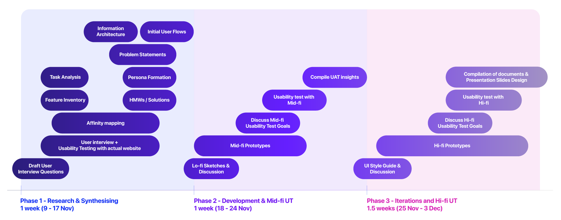
Timeline
As a team, we discussed how we should allocate the time to tackle the project within the given timeline and assign roles to the tasks to boost productivity. The schedule was extremely useful for us because we were able to set realistic expectations and deadlines for ourselves.
Insights from the first user interviews of the website
Insights from the first user interviews of the website
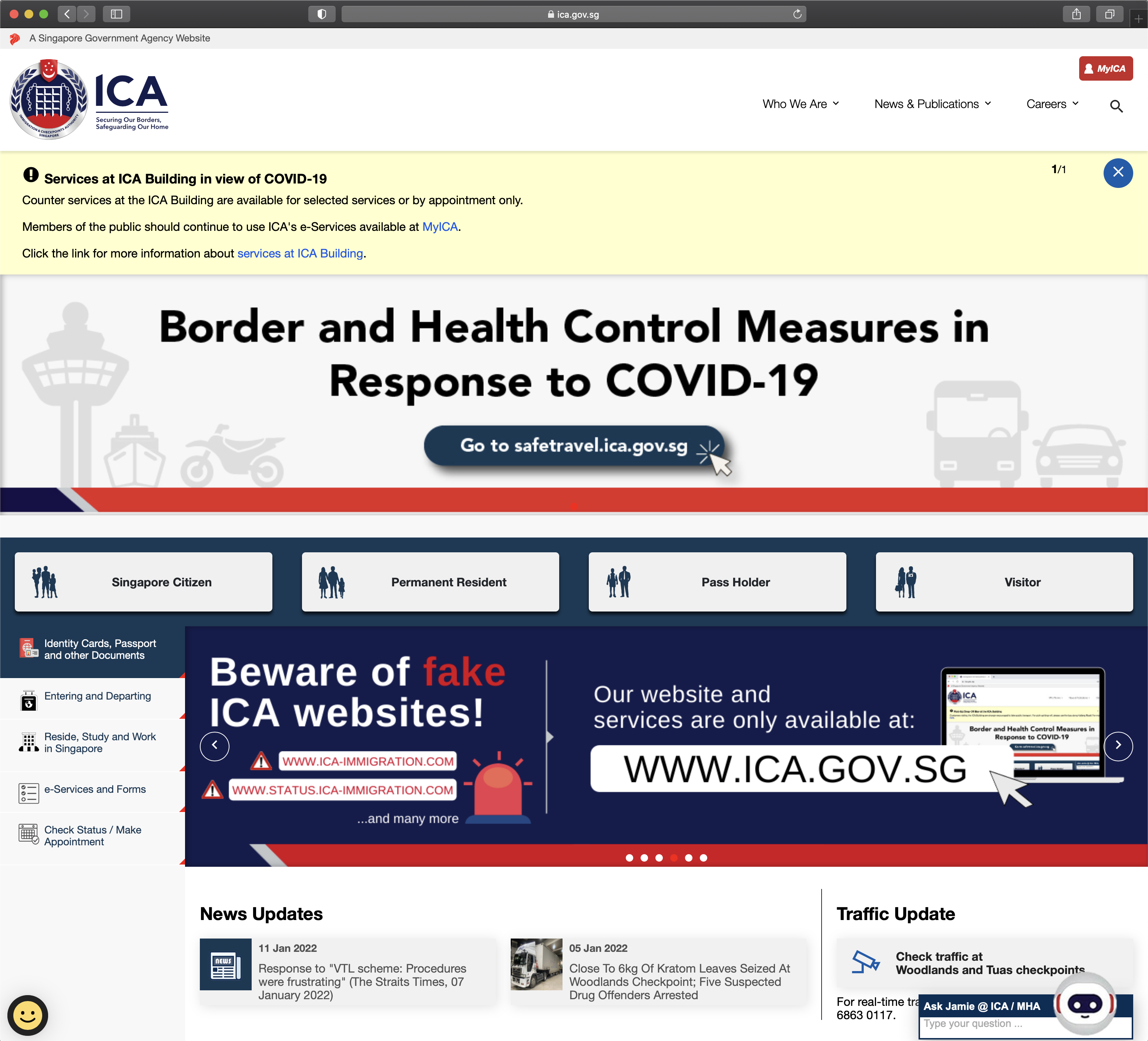
Current ICA Website
User selection criteria
-
Users must have used the ICA website in the past 1-3 years
- Tech-savvy and prefer to do their applications online.
With Dionne and Mabel, we interviewed 10 users. I asked several questions such as reasons for using the ICA site, their browsing habits, and their understanding of ICA. In the next part of the interview, I invited them to perform specific, scripted tasks on the website. Some points of the discussion were memorable:
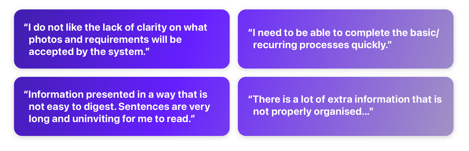
Overall, the users report the website to be a frustrating experience:

Evaluating our website’s opportunities
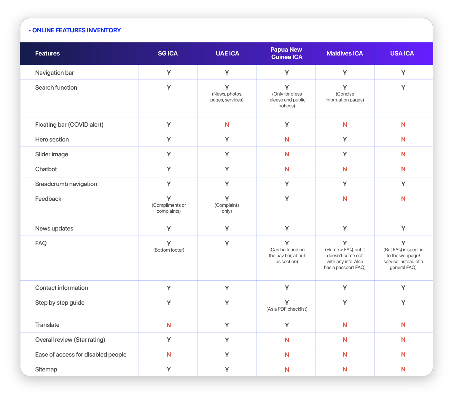
The team agreed that immigration websites of other countries should be used for feature inventory analysis:
UAE ICA Papua New Guinea ICA Maldives ICA USA ICA
From the results that was compiled by Louis and Kangni, it gleaned to us that ICA’s website does not lack in the features, rather, it faired similarly to other websites.
UAE ICA Papua New Guinea ICA Maldives ICA USA ICA
From the results that was compiled by Louis and Kangni, it gleaned to us that ICA’s website does not lack in the features, rather, it faired similarly to other websites.
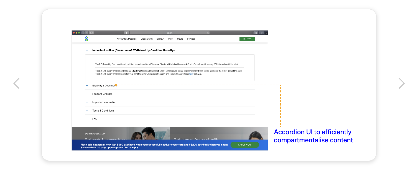
We also compared ICA’s website against similar government-related and services websites for their effectiveness in providing services to their users, intuitive navigation, and usability:
CPF Standard Chartered UAE ICA
CPF Standard Chartered UAE ICA


Our intended users
We identified two personas through conducting user interviews, surveys and usability tests.


Problem statement
Candice and David need a smooth and straightforward way to efficiently complete their immigration-related tasks on the ICA website because they find it taxing and daunting to look through a cluttered and unintuitive interface.
The problem statement helped clearly frame issues and needs of our users, and the next step was addressing them through our solutions, keeping our focus on the users at all times.
Solution
It was clear to us the navigation and content structure of the site makes for an unnecessarily complex experience. With that in mind, we agreed that:
By reorganising ICA's information architecture in a more systematic manner and providing visual and iconographic representation of information, users will be able to find what they need accurately and understand key information at a glance.
Through further testings, we evaluated the website’s usability when users have lesser errors & touchpoints.
Restructuring website content
We proceeded to map out the current information architecture to grasp the website’s functionality. This allowed better clarity on the current website’s interaction paths for website visitors. We found several issues:
• Overlapping content across secondary navigation
• Two conflicting primary navigation
• Complex terminologies
• Overlapping content across secondary navigation
• Two conflicting primary navigation
• Complex terminologies
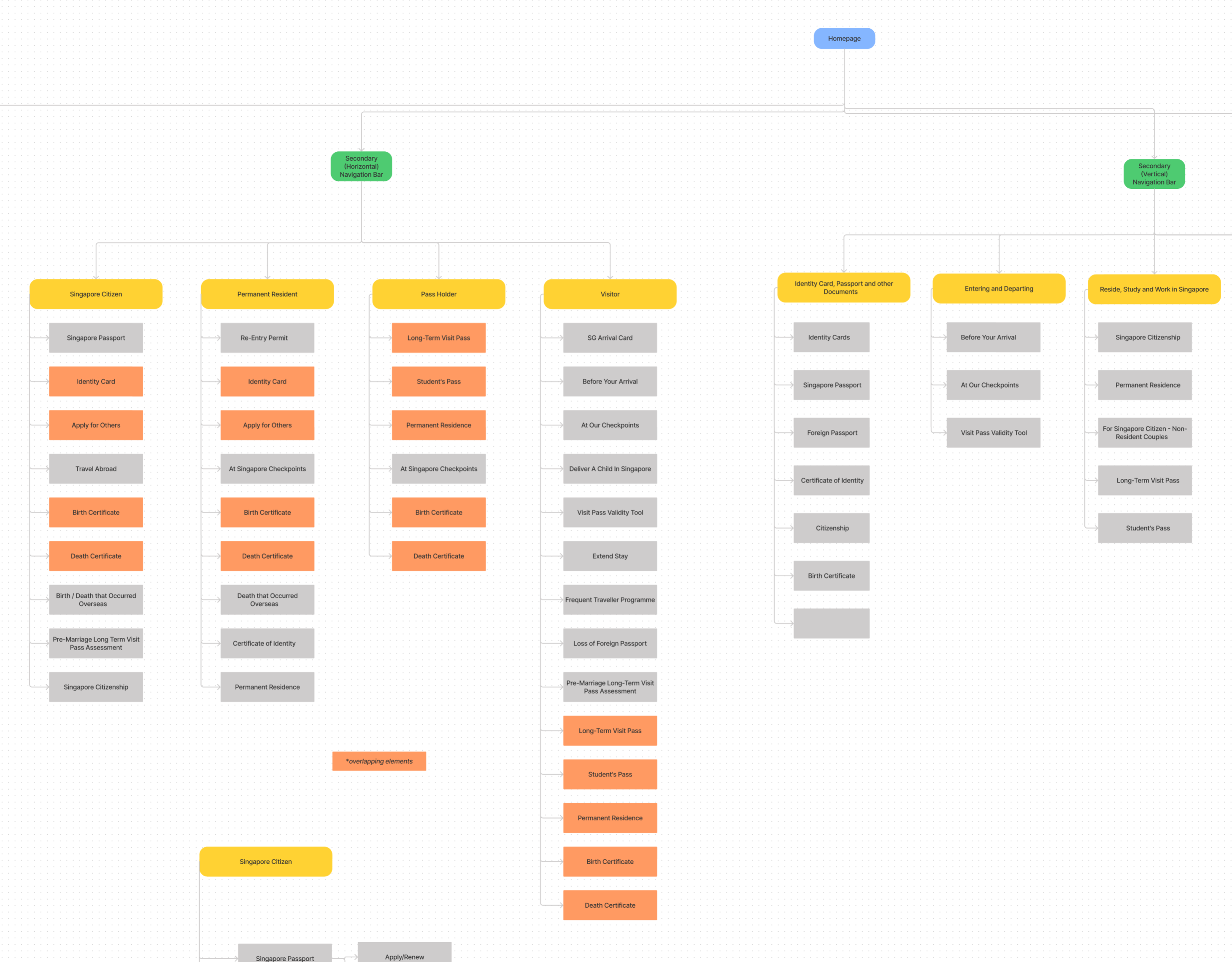
A screenshot of ICA’s current website IA.
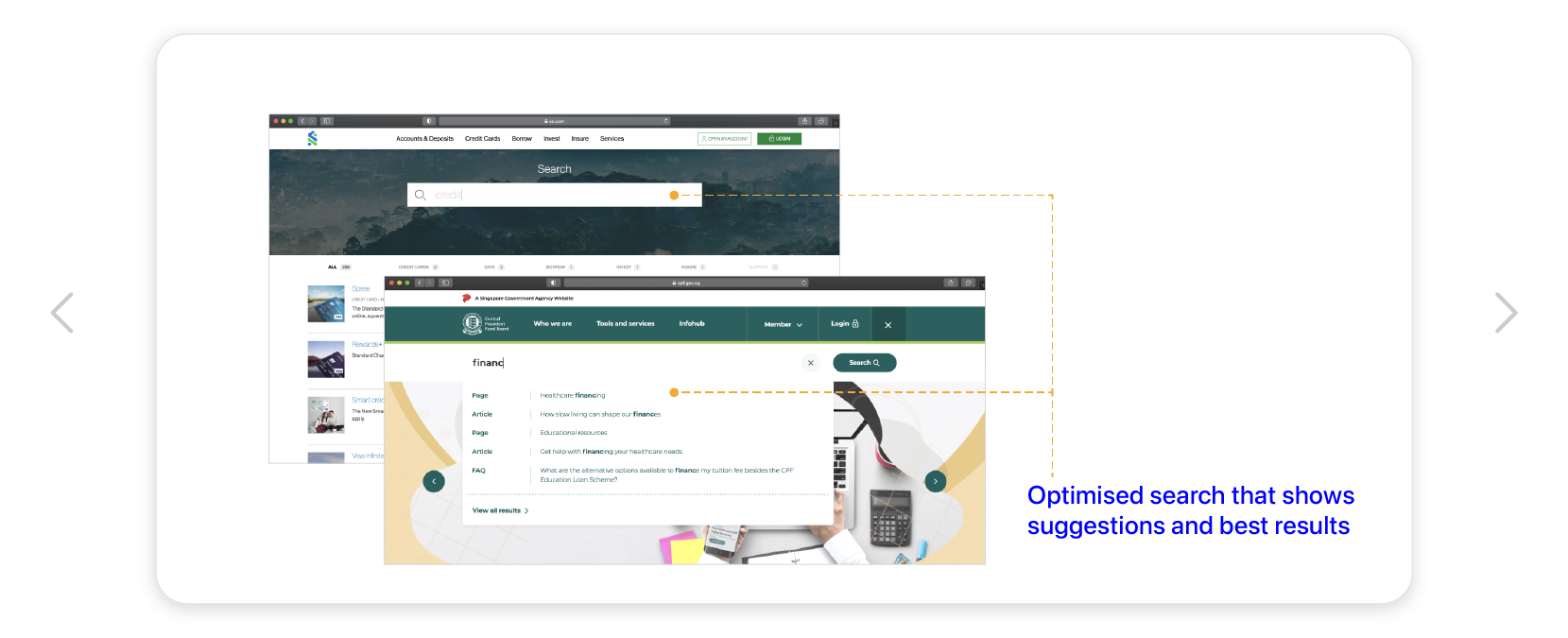
Below were some features we determined would aid in an intuitive browsing experience:

Mid-fi wireframes
A desktop-first approach was adopted as users prefer to execute complex tasks on their desktops. It was also designed to be responsive so the mobile experience doesn't veer too much from the desktop site.


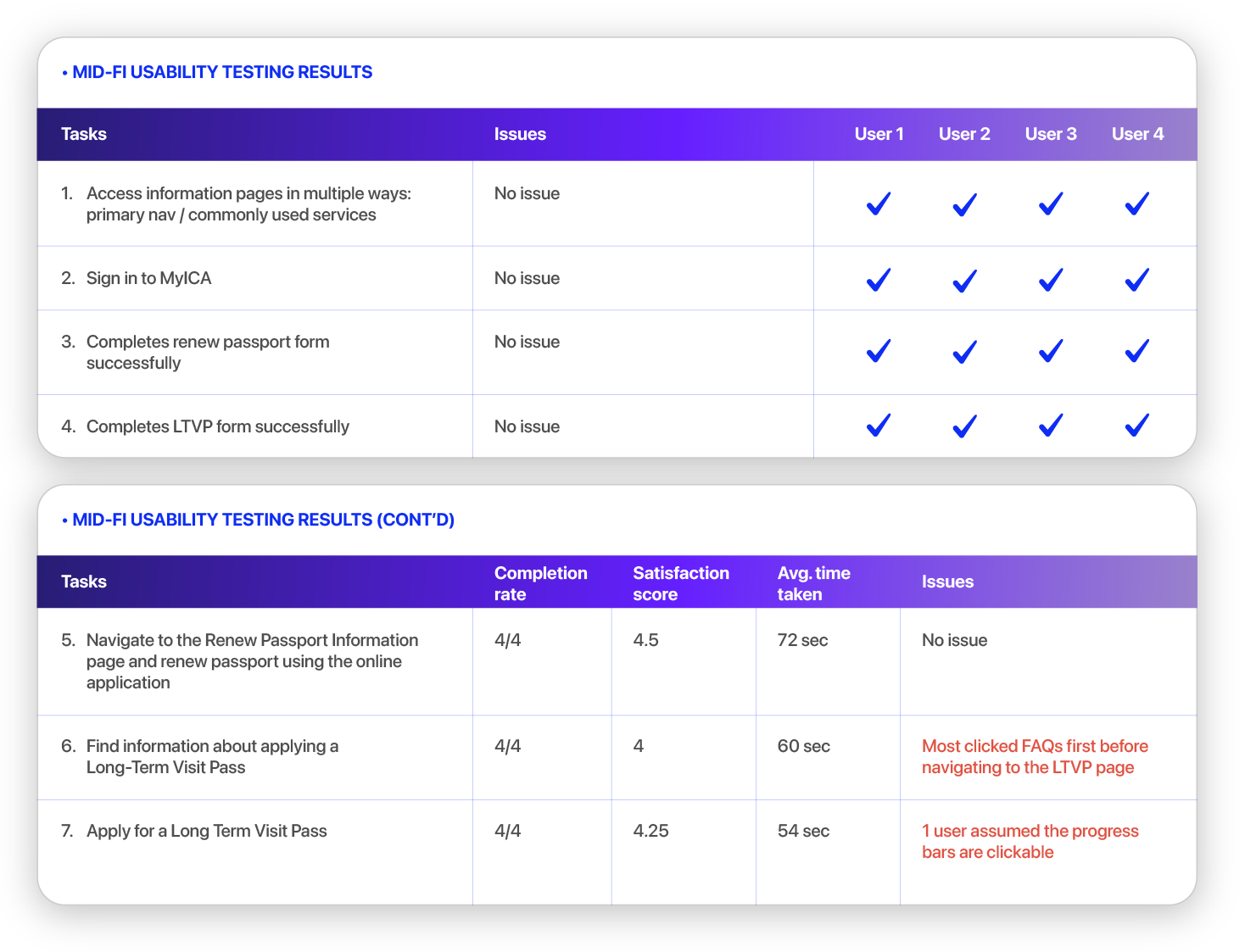
Mid-fi wireframes usability testing
A second usability testing was done on our Mid-fi wireframes to spot early issues before we proceed to the Hi-fi prototypes. To fit closely to our user personas, we interviewed 4 users who have been users of the ICA website in the past.
Results
The users’ satisfaction scores and average time taken to complete tasks showed huge improvement compared to the previous site.
Results
The users’ satisfaction scores and average time taken to complete tasks showed huge improvement compared to the previous site.
Iterations on Mid-fi
From the usability testing, we improved the wireframes further.


Prototype for desktop and mobile

Design decisions
The team was fully involved in the design process. Mabel led the team as the project manager, making sure we were completing the frames within the allocated time. Mabel, Louis and Kangni were in charge of the application form designs and consistency in the UI elements, while Dionne and I worked closely on UI writing for the content.
As the creative lead, I took charge of the visual design of the website, development of the navigation structure and features, but the team collaborated closely during the design process.
As the creative lead, I took charge of the visual design of the website, development of the navigation structure and features, but the team collaborated closely during the design process.
Style guide
Before we proceeded to the Hi-fi development stage, we implemented a style guide to define a consistent look and feel to our website.
Before we proceeded to the Hi-fi development stage, we implemented a style guide to define a consistent look and feel to our website.
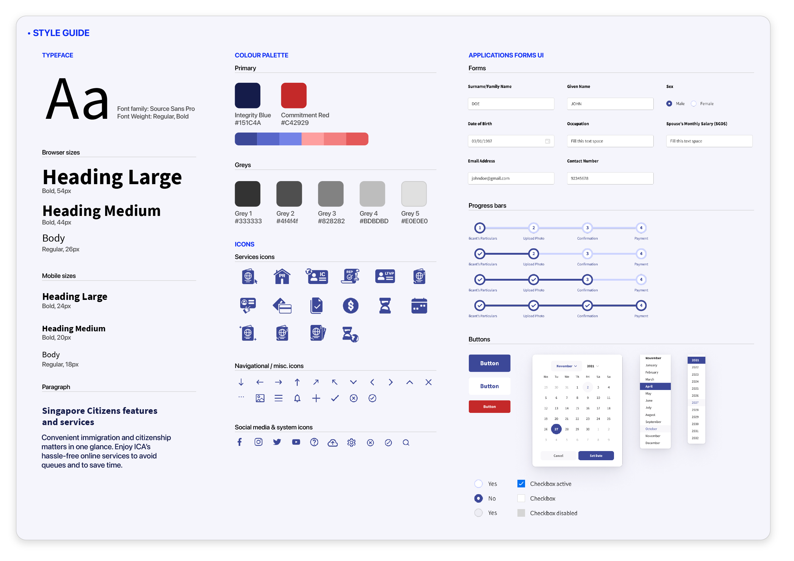
Iconography
As we had to simplify complicated and wordy content, icons help to emphasise and clarify content, allowing information to be efficiently conveyed. I designed the set of service icons for the website.
As we had to simplify complicated and wordy content, icons help to emphasise and clarify content, allowing information to be efficiently conveyed. I designed the set of service icons for the website.

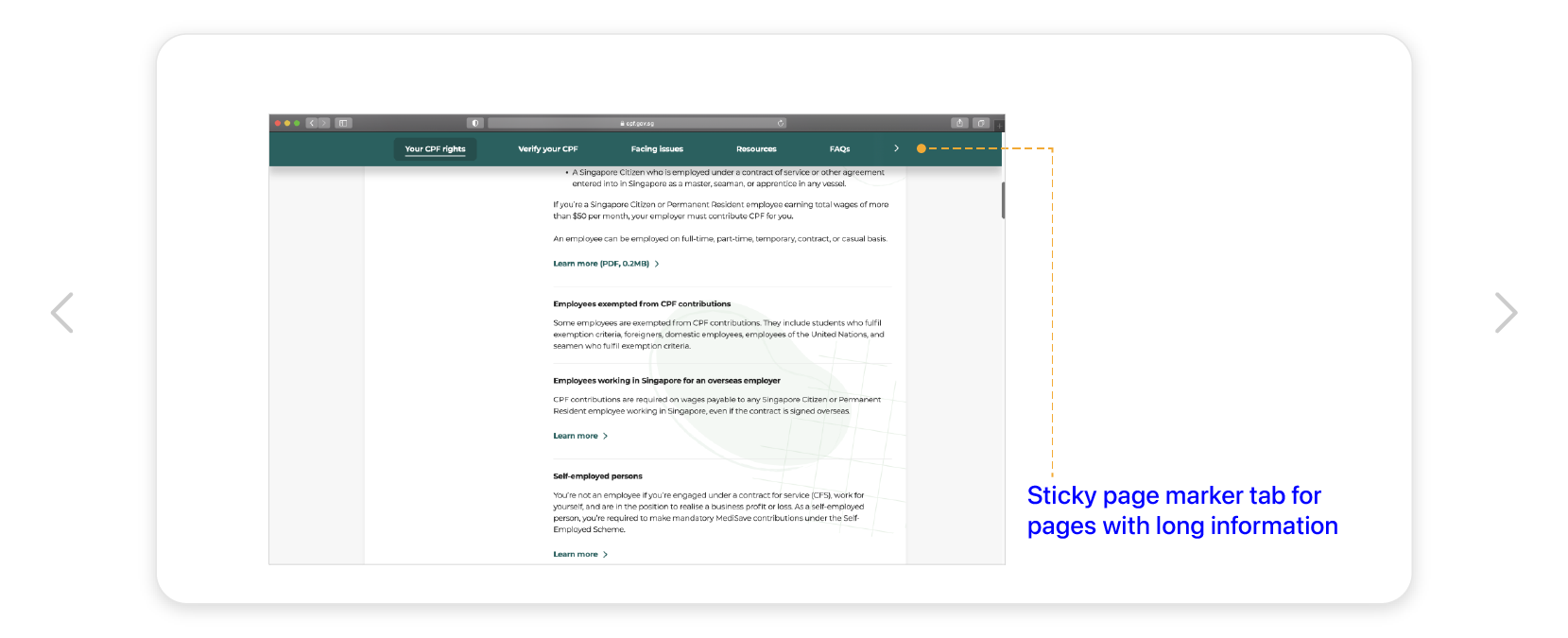
Page section tab
Users commented the numerous scrolling up and down long information pages was an inconvenience when they need to refer to a specific section for information. We designed a page section tab that sticks to the top as the user scrolls down the page, with markers to guide users along. Specific sections can be quickly navigated with just a click.
Users commented the numerous scrolling up and down long information pages was an inconvenience when they need to refer to a specific section for information. We designed a page section tab that sticks to the top as the user scrolls down the page, with markers to guide users along. Specific sections can be quickly navigated with just a click.

Hi-fi usability testing plan & results
We tested our prototypes on 5 users, closely fitting our user personas. Compared to the original ICA website, our Hi-fi prototypes achieved better satisfaction scores in the tasks, and users actually spent lesser time completing them. Results were very encouraging:

Next steps
With the redesign of the ICA website, users can access information quicker than before as there are lesser steps needed to navigate through the website. The improvement of how information is presented on the page enabled them to understand the various applications better and perform their tasks confidently.
Some considerations could be further explored in the future:
• More interaction of the progress bar in application forms.
• Further user testings to streamline website user experience.
• Addition of announcement/notification banner.
• Explore other features available for the website.
• More interaction of the progress bar in application forms.
• Further user testings to streamline website user experience.
• Addition of announcement/notification banner.
• Explore other features available for the website.
Project reflections
“Creating and refining UX deliverables is not a solitary act.”
- Nielson Norman GroupIt was my first group project in General Assembly, and I thoroughly enjoyed the collaboration process. Every member of the team was deeply motivated, clocking as much hours we could while we had our full-time jobs in the daytime. Working in a team, it was helpful to avoid bias and create a more robust design with everyone’s inputs. Each of us had our strengths and weaknesses, but we complemented well with each other, tirelessly working from the initial stage to completion.
In situations where we have disagreement in opinions, we conducted ourselves professionally. We actively listened and tried to understand from others’ perspective, providing solutions that everyone would be in the agreement.
The best takeaway from the project would be growing and learning as a team. I am so pleased with our outcome, and I truly enjoyed working with my team members.
![]()
In situations where we have disagreement in opinions, we conducted ourselves professionally. We actively listened and tried to understand from others’ perspective, providing solutions that everyone would be in the agreement.
The best takeaway from the project would be growing and learning as a team. I am so pleased with our outcome, and I truly enjoyed working with my team members.

See more of my work:
