Invigorating Art Friend's
e-commerce experience
A student project for the UX Design Flex course at General Assembly.
Objective
• Improving the digital experience of purchasing products and services of the business.
• To enhance the online experience and make it easier for people to order some products online.
• To enhance the online experience and make it easier for people to order some products online.
Roles
UX Design, User & Market Research, Figma Wireframing & Prototyping, Usability Testing, Presentation Design
Overview
A well-known brand, Art Friend has been serving fine art & graphic artists, hobbyists and companies in the art and design sector since 1981. However, its e-commerce website has not kept up with the latest digital trends and services.
In an ever-changing digital landscape where brands are quickly revamping their e-commerce experience, a refreshed design and re-look to the needs of users is most vital.

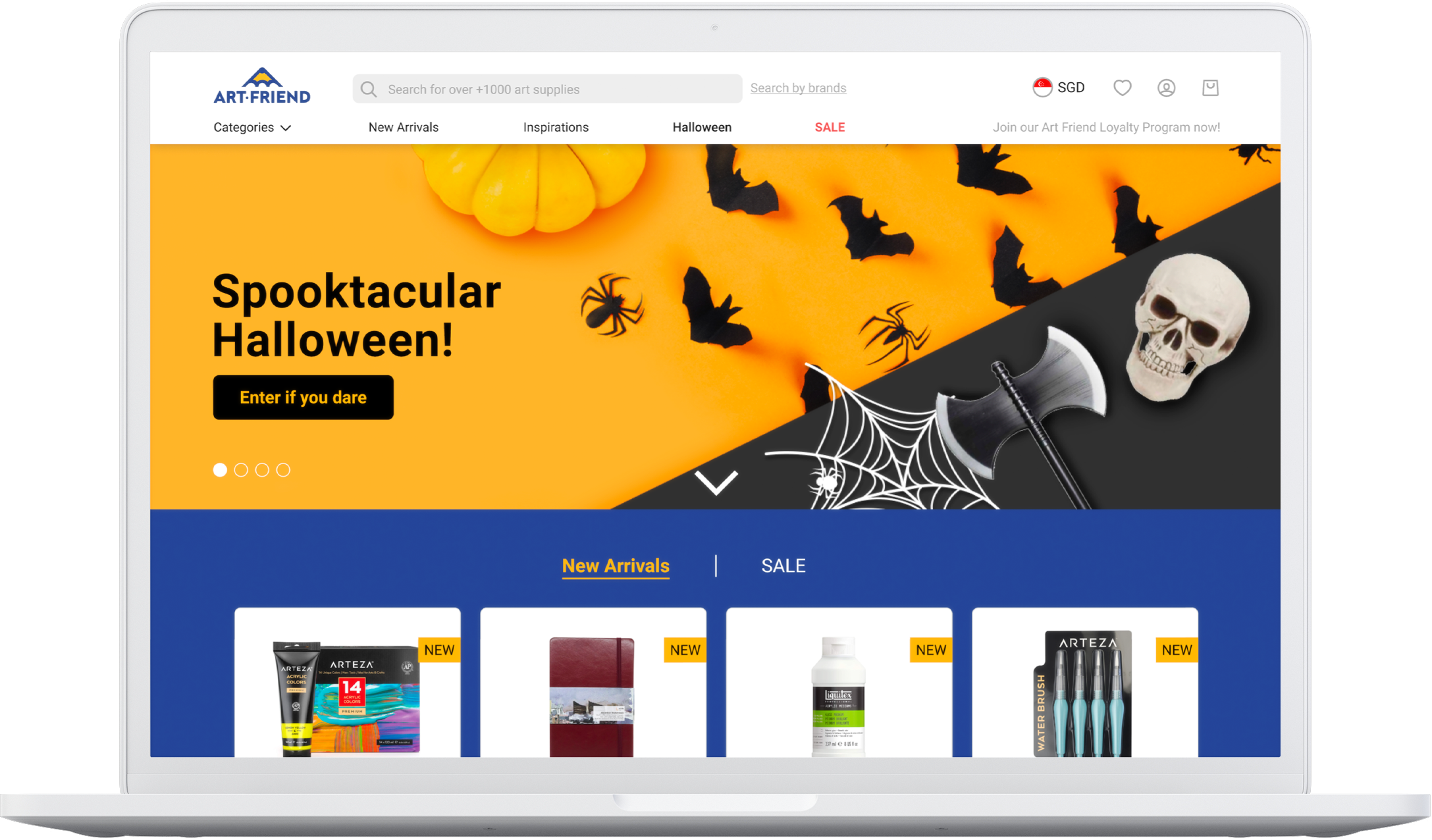
Current Art Friend website
Insights from the first user interviews of the website
User selection criteria
• Shops art and craft supplies for themselves or their family
• Tech-savvy and frequently shops online
• Engaged in artistic hobbies
The interviews gave insights into what users think about the site, and through the interviews, some points of the discussion were memorable:

Overall, users report the website to be a tedious and unintuitive e-shopping experience:

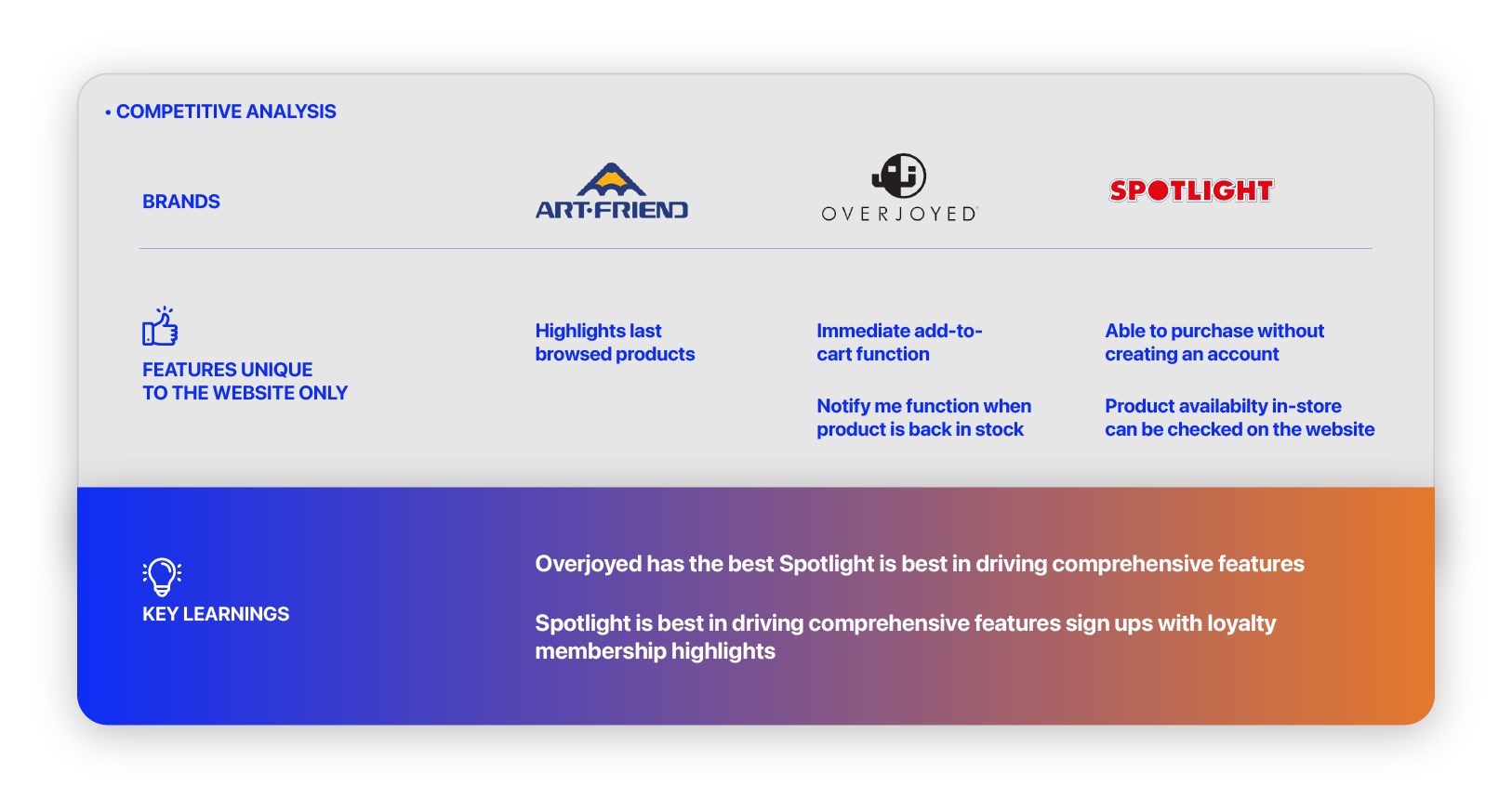
Benchmarking against other competitors
From the competitive analysis, Art Friend’s website, in comparison to brands like Overjoyed and Spotlight, offers lesser features to customers. Comparing the brands it was clear that navigating Art Friend’s website is more challenging to use and less functional. Most importantly, the interface does not help drive purchases.
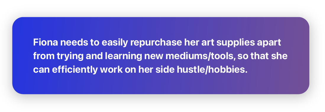
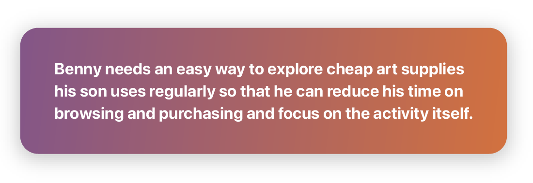
Our intended users
I identified two personas through conducting user interviews, surveys and usability tests.


Problem statements
From the personas, I derived problem statements that would help frame the issues and needs of my users. The next step is addressing them through my solutions, keeping my focus on the users at all times.
Solutions
While the goals and characteristics for Fiona and Benny are distinctively different, both are highly motivated buyers. I was able to derive a few solutions that would improve the site’s experience for real customers through their profiles.
I will know this to be true when we see users have lesser errors and touchpoints during the usability testing phase.
Some possible solutions:
I will know this to be true when we see users have lesser errors and touchpoints during the usability testing phase.
Some possible solutions:
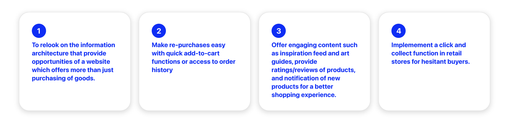
Defining clear objectives and scope for design
The research phase made it easier to define features for the project. Here are the main objectives that will serve as goals for the duration of the project:

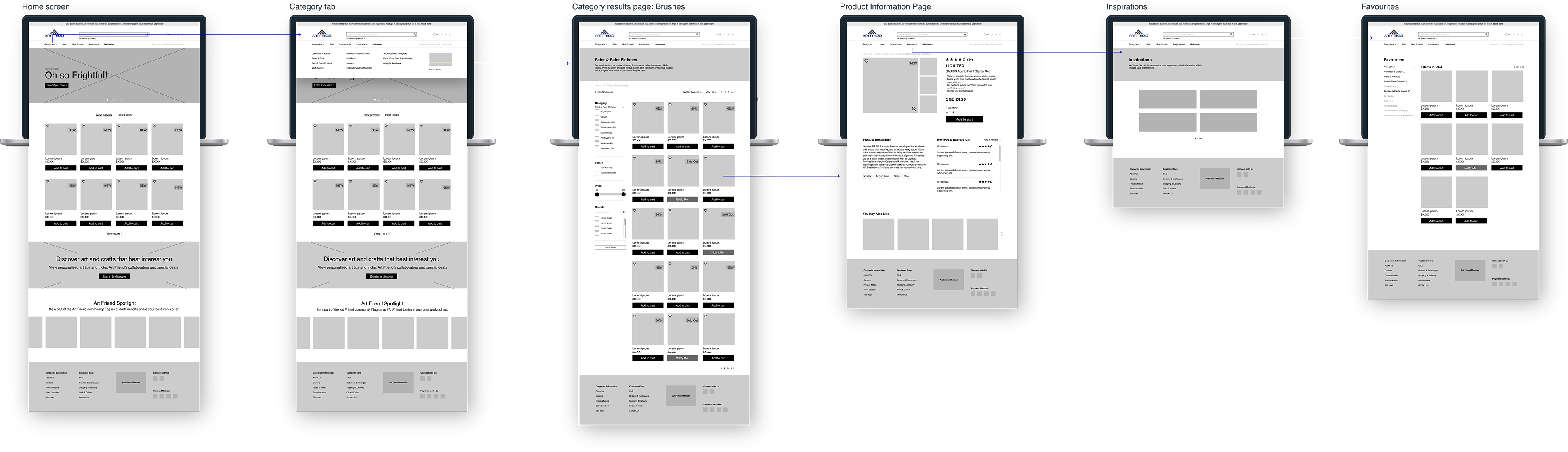
Mid-fi wireframes
I took a desktop-first approach since users are reported to spend time reading up on products to make an informed decision before purchasing.
Restructuring website content
Information Architecture
To refresh the site’s content, I ran a Card Sort with 6 users and used the results to create a new site map that maps out the architecture of the site.
To refresh the site’s content, I ran a Card Sort with 6 users and used the results to create a new site map that maps out the architecture of the site.
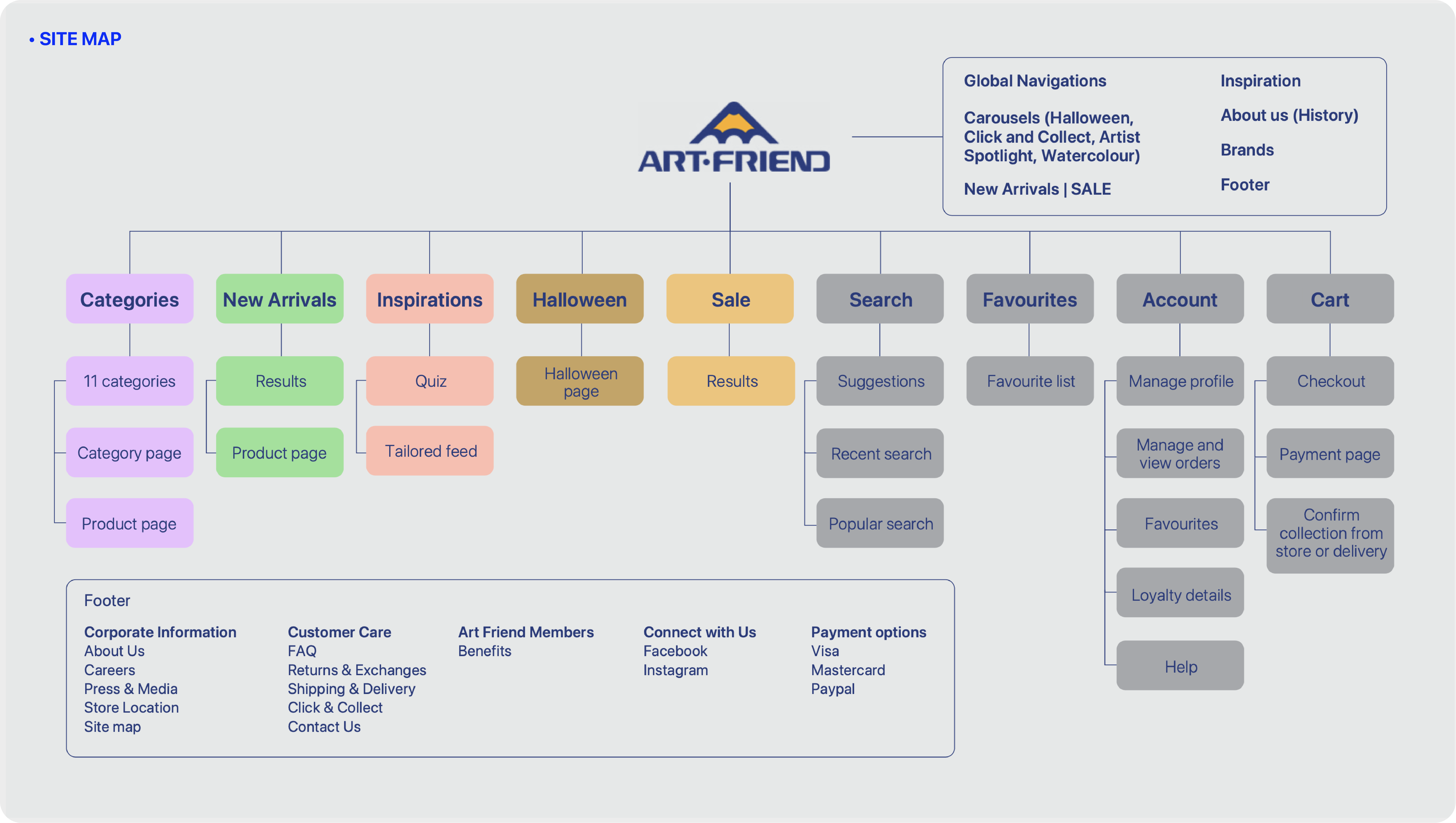
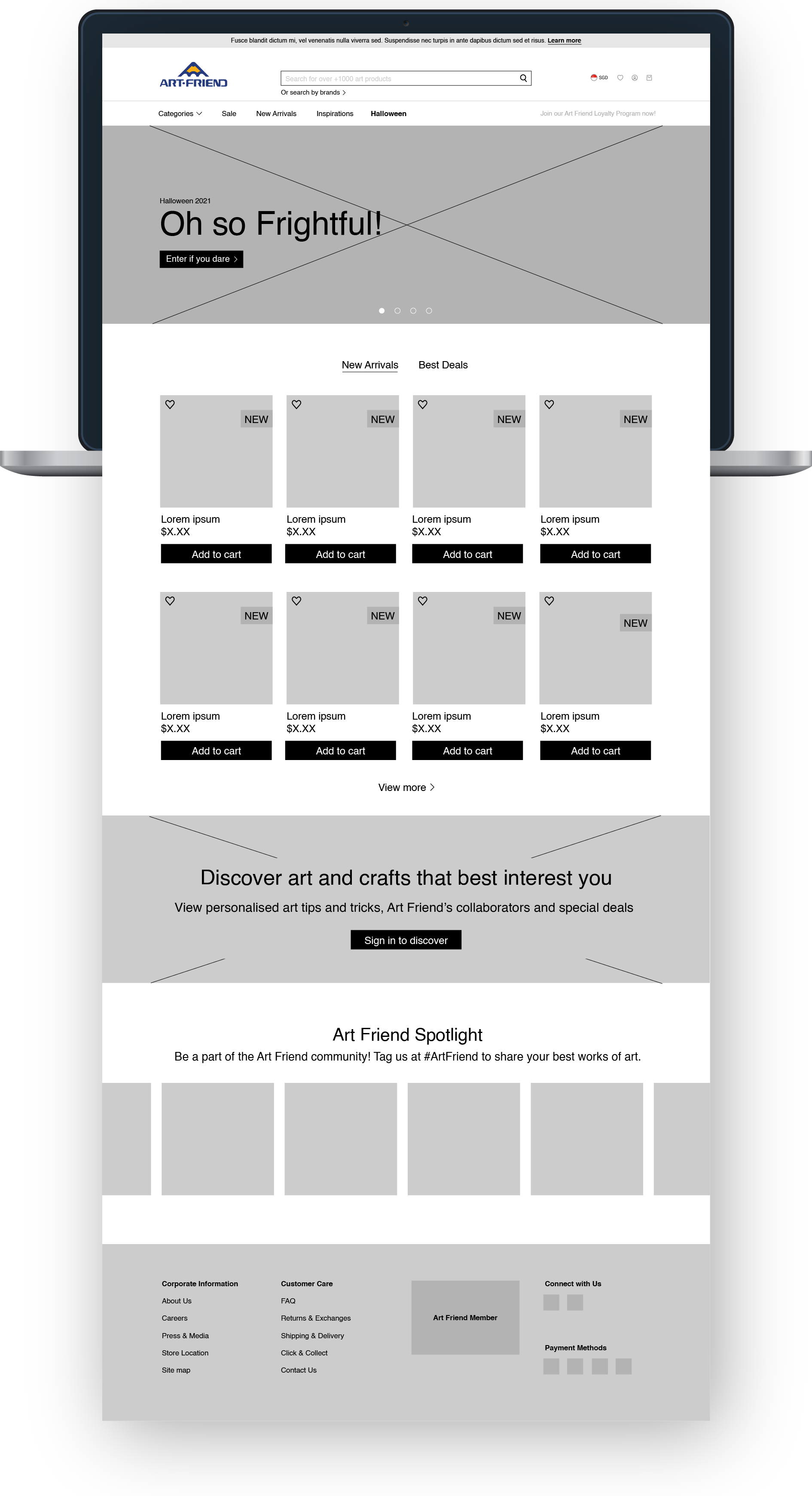
With the new IA, a carousel banner appears foremost to drive conversion and highlight products or promotional events. I’ve also made it easier for users to access deals or new products with easily toggled product listings on the homepage. Users sign-ups and information on the company is listed lower on the page.
Design decisions
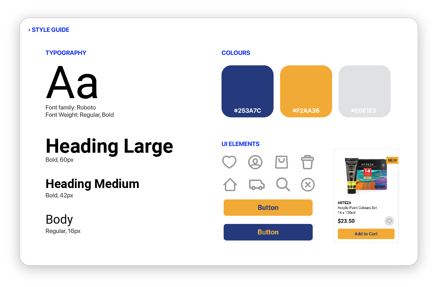
Colour theory
Art Friend’s well-recognised orange and blue defines the main colour palette for the website. Product listings are held in cards, with blurbs to communicate if it’s a new product or on a promotional price etc.
Art Friend’s well-recognised orange and blue defines the main colour palette for the website. Product listings are held in cards, with blurbs to communicate if it’s a new product or on a promotional price etc.
Navigation
Through card sorting with my users, the main navigational bar is sorted by the category of art supplies.
Through card sorting with my users, the main navigational bar is sorted by the category of art supplies.

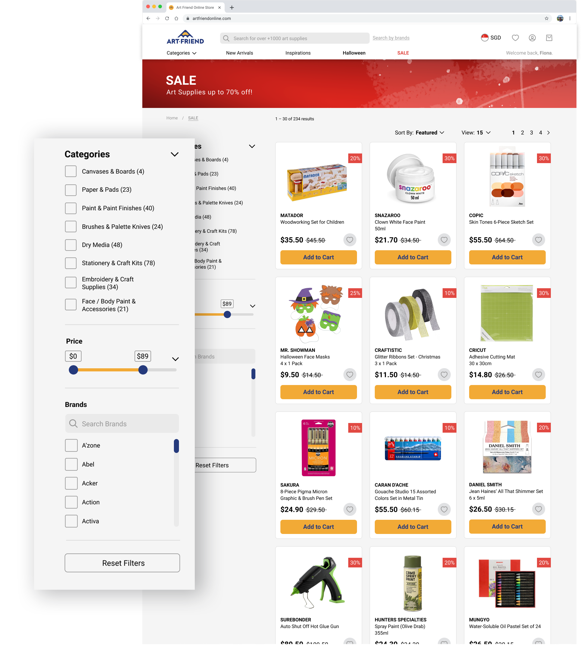
Filters
What was frustratingly missing on the previous website was actionable filters. The website redesign allows users to refine search results to efficiently locate products to their needs and preferences.
What was frustratingly missing on the previous website was actionable filters. The website redesign allows users to refine search results to efficiently locate products to their needs and preferences.
Prototype for desktop and mobile

Usability testing plan & results
For the testing, I interviewed 5 users who are late 20s to early 30s and frequently buys art supplies. They also are familiar with Art Friend and have purchased art supplies from the stores before. Through remote testing (Zoom), I established a few goals and tasks for the interview in consideration:
Goals
Goals
- Users should be able to register or login to see a personalised homepage and add products to their favourites list
- Users should be able to find and view last purchased items
- Users should be able to locate products in multiple ways
- Users should be able to complete the checkout flow quickly

Results
While most of the tasks were successfully completed, a few minor issues appeared during the testing: confusing sections such as the ratings/ reviews, consistency of labelling sections, and UI of CTA buttons. Those can be refined for a more intuitive and smoother shopping experience for the next iteration.
While most of the tasks were successfully completed, a few minor issues appeared during the testing: confusing sections such as the ratings/ reviews, consistency of labelling sections, and UI of CTA buttons. Those can be refined for a more intuitive and smoother shopping experience for the next iteration.
Next steps
The redesign of the website has significantly improved and value-add a user’s shopping experience, invigorating Art Friend’s image to their customers online, and offline. The website can be further improved with a few points for consideration:
- Consider housing tutorial videos on product information pages
-
Refine product card
design so that it offers
more interaction
(changes image when
mouse hovers, etc.
-
Further usability
testings to streamline
website’s experience
Project reflections
It was very much a rewarding and fulfilling experience to work closely with users and to understand their needs and pain points. Throughout the entire process, their feedback informed me of every design decision, and with much trial and error, the project was completed. Their perspectives have enlightened me of some hasty assumptions that I may have made along with the duration of the project, and I was quick to address that. The project has prepared me for what it entails to be a UX Designer, and I’m pleased with my learnings and design outcome. I can’t wait to jump straight to my next UX project!
![]()


See more of my other works:
